
storytelling with data podcast
storytelling with data
0
The storytelling with data podcast, hosted by bestselling author and data visualization expert Cole Nussbaumer Knaflic, aims to rid the world of ineffective graphs and mediocre presentations. Each episode covers topics related to data storytelling, better presentations, and all things data viz. The podcast provides practical advice and insights for improving how we communicate with data.
Episode
-
 designing transitions 16.09.2026 29mntWhat happens in the space between one thing and the next? Whether you’re moving from email to deep thinking, analysis to communication, or one idea to another, these shifts require time and mental energy. In this episode, Cole explores how thoughtfully designing transitions can help you work, think, and communicate more effectively. Discover practical ways to use time, space, movement, and other cues to shift your mindset—and help your audience follow your story. Small changes in how you get from here to there can make a surprisingly big difference.RESOURCES MENTIONED:Show notes: https://www.storytellingwithdata.com/podcast/112Join the next cohort of our public 8-week online course: plan, create & deliver - use the code PODCAST10 for 10% off!Book your storytelling with data team training!Episode 83: reflect & refine (sharing statio, a meditative pause during a transition)Episode 6: say it out loudEpisode 86: speak so others listen
 -
 waterfall charts: what they are and how to use them 09.09.2026 9mntWaterfall charts are great at showing what happened between where you started and where you ended—but they can look a little strange if you’ve never encountered one before.In this episode, Alli explains what a waterfall chart is, when to use one, and how to make it easier for your audience to read. Plus, she highlights three clever examples from the storytelling with data community that use color, annotations, and even small multiples to make the most of this less-common chart type.RESOURCES MENTIONED:Show notes: https://www.storytellingwithdata.com/podcast/111Book your storytelling with data team training!Waterfall chart definition, examples, and the how-to videoWaterfall community challengeJian’s waterfallKeith’s waterfallAndrew’s waterfall
 -
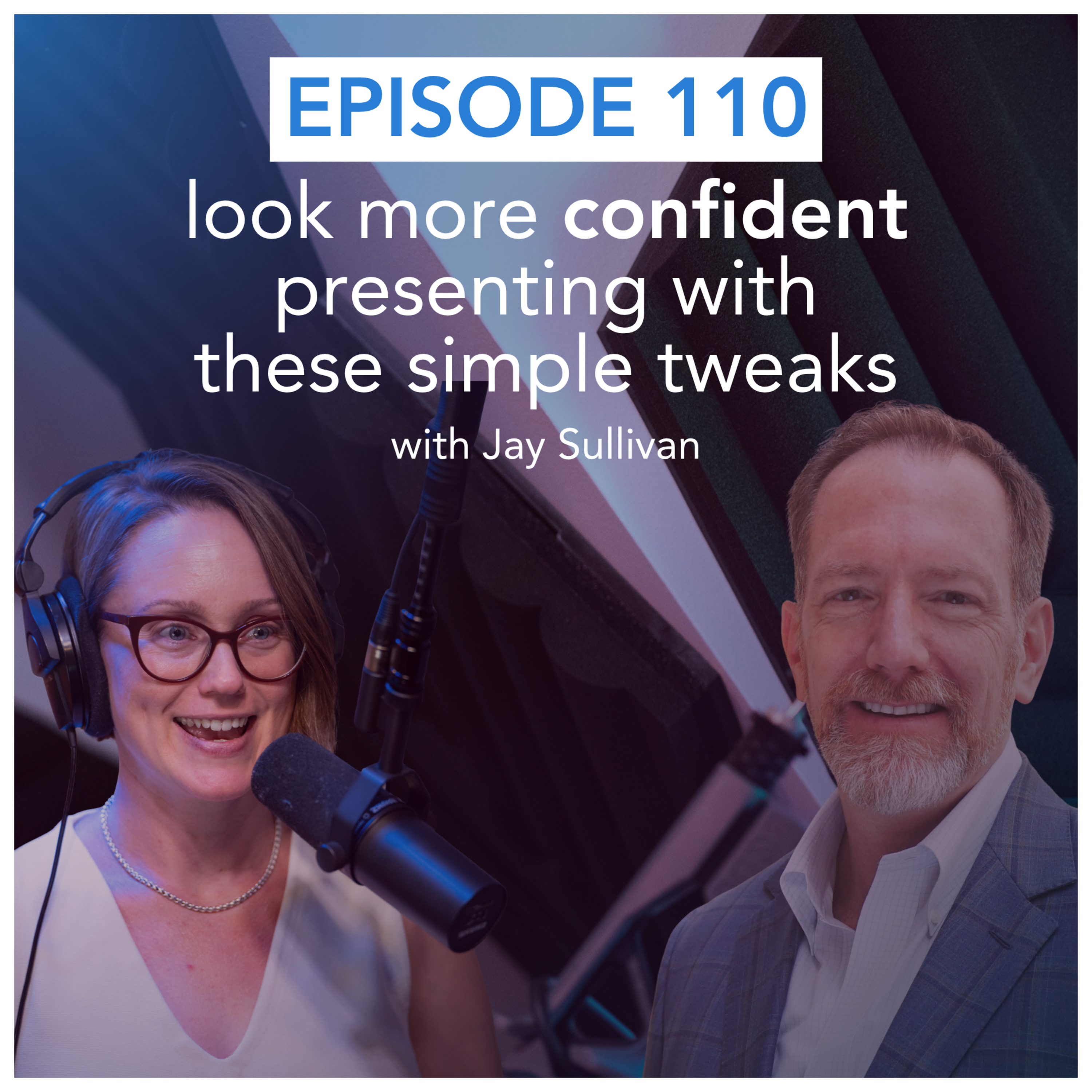 look more confident presenting with these simple tweaks with guest Jay Sullivan 02.09.2026 27mntConveying confidence when presenting often comes down to a few small, intentional choices. Jay Sullivan, author of Simply Said and communication expert at Exec|Comm, shares three simple tweaks that can make an immediate difference.You’ll learn:his smart approach to eye contactwhat the “Arc of Silence” is and how to use itthe helpful acronym “RIDE” to clearly explain a chart that you’re presentingShow notes: https://www.storytellingwithdata.com/podcast/110RELATED LINKSBook your storytelling with data team training!Simply Said by Jay SullivanMore about Jay’s work at Exec|CommConnect with Jay on LinkedIn
 -
 how to build tension in your data story 26.08.2026 16mntWant to make your data story more engaging? Try adding a little tension. Join data storyteller Alli Torban as she explores how tension can create curiosity and keep your audience invested in your story.You’ll learn three simple ways to build tension—expectation versus reality, knowledge tension, and action tension—and see how members of the storytelling with data community put each technique into practice.RESOURCES MENTIONED:Register for our 8-week online course: plan, create, and deliver your data story. September 28th–November 22nd, 2026. Use the code PODCAST10 for 10% off your registration!Join the storytelling with data community!Look through the community exercise submissions for building tensionDanny’s submissionMiroslav’s submissionRegina’s submissionPodcast: help! my data story feels boringBook your own custom team training!
 -
 how to handle the “prove me right” problem 19.08.2026 21mntWhat do you do when a leader asks you to find data to prove them right?In this episode, data storytellers Ryan Biesecker and Alli Torban explore the difference between investigating a hypothesis and validating a foregone conclusion. They share practical ways to ask better questions, approach analysis with curiosity, and navigate the tricky situation when the data doesn’t support what your leader expected.Learn how to protect your credibility while respectfully managing upward.SHOW NOTES:https://www.storytellingwithdata.com/podcast/108RELATED RESOURCES:Register for our virtual, public workshop on August 20, 2026. The next public workshop is November 5, 2026 (use code PODCAST10 for 10% off our public workshops and on-demand courses)Blog: what if my audience wants a different story?Blog: don't fall victim to "the curse of knowledge"Blog: how do I give an unbiased recommendation to my analysis?Community Conversation: around challenges while driving changePodcast: the challenges of changeBook your own custom team training!
 -
 help! my boss gave me a slide limit 12.08.2026 8mntHow do you handle a presentation when your boss gives you a slide limit? Join data storyteller Alli Torban as she tackles this common presentation constraint.You'll learn why limiting slides doesn’t necessarily lead to shorter presentations, how negotiating for a time limit instead can lead to clearer communication, and practical strategies for when the slide limit truly isn’t negotiable.SHOW NOTES: https://www.storytellingwithdata.com/podcast/107RESOURCES MENTIONED:Register for our virtual, public workshop on August 20, 2026 (use code PODCAST10 for 10% off our public workshops and on-demand courses)Alex’s blog post: limit the minutes and let the slides slideBook your own custom team training
 -
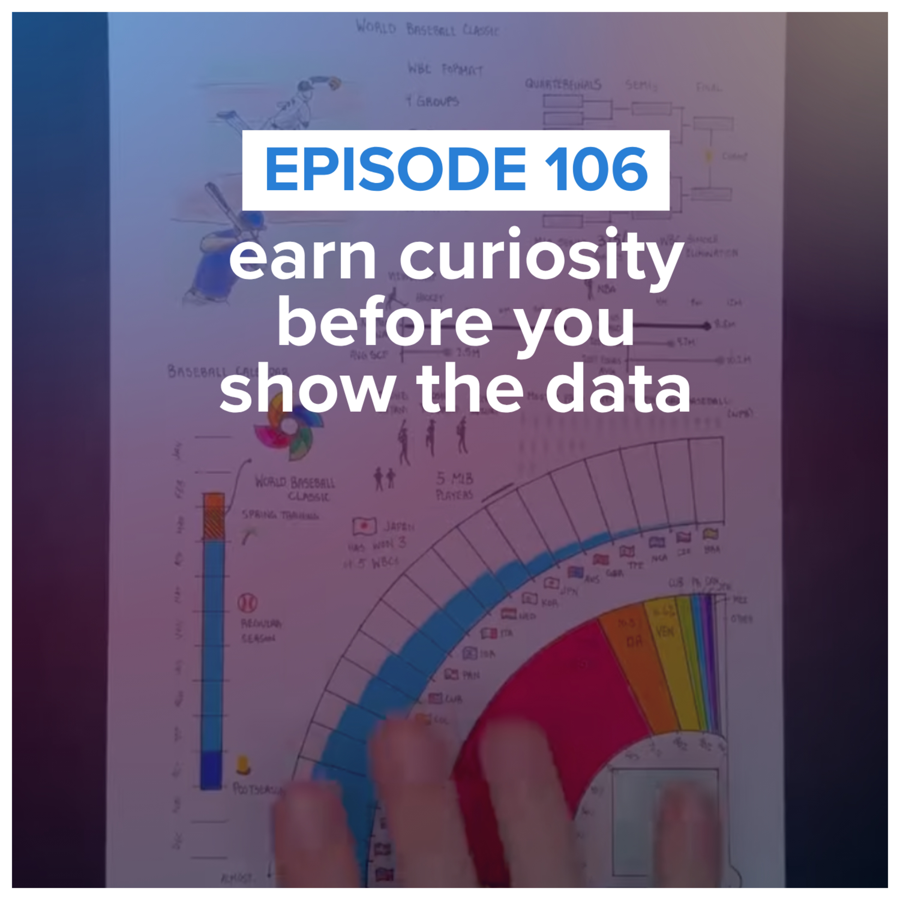 earn curiosity before you show the data with guest Riley Martin 05.08.2026 27mntJoin data storyteller Alli Torban as she talks with Riley Martin, founder of Sportsball, about one of the hardest parts of data storytelling: getting people to care before you show the data. You'll learn how Riley translates complex topics into approachable visual stories, why he assumes his audience starts with little or no background knowledge, and practical techniques for uncovering what your audience actually wants to know. Show notes: https://www.storytellingwithdata.com/podcast/106RESOURCES MENTIONED:Register for our virtual, public workshop on August 20, 2026 (use code PODCAST10 for 10% off our public workshops and on-demand courses)Riley Martin on LinkedInSportsball websiteIlia Malinin figure skating infographicSakura Micron pensPentel PointLiner pensZebra ClickArt markersFlourish Studio
 -
 AI is flattening your data stories (and how to fix it) 29.07.2026 9mntJoin Cole Nussbaumer Knaflic as she shares how AI can quietly flatten your data stories. You’ll learn why AI tends to smooth over the tension that makes a story compelling, how to keep the sharp edges that move your specific audience, and practical ways to stay in control—from analog brainstorming to sharper prompts. The goal: use AI as a thought partner without letting it dilute your perspective.Show notes: https://www.storytellingwithdata.com/podcast/105RESOURCES MENTIONED:Learn about our Enhance with AI team trainingRead our blog series on practical AI guidanceWatch our live event on YouTube: AI for data storytellingUse code PODCAST10 for 10% off our public workshops and on-demand courses
 -
 the slide title mistake we see often 22.07.2026 5mntJoin data storyteller Alli Torban as she shares a very common slide title mistake: using questions as your slide titles. You'll learn why question-based titles can divide your audience's attention, how to write a better title, and a simple bonus tip for making both your slide titles and chart titles work together. It's a small change that can make your presentations much easier to understand.Show notes: https://www.storytellingwithdata.com/podcast/104RESOURCES MENTIONED:Simon Rowe's blog post: "be careful using questions as slide titles"Alex Velez's blog post: "transforming slide titles"Watch our AI virtual event recording on YouTubeLearn about our Enhance with AI team trainingUse code PODCAST10 for 10% off our public workshops and on-demand courses
 -
 how to improve your design (no artistic talent needed) 15.07.2026 22mntDo you have to be a designer to create better visuals?Join data storytellers Alex Velez and Alli Torban as they share practical ways to train your design eye by studying great examples, recreating charts, and seeking feedback—all while making intentional design decisions that help your audience understand your message faster. If you've ever thought, "I'm just not a designer," this episode will show you where to begin.Show notes: https://www.storytellingwithdata.com/podcast/103https://www.storytellingwithdata.com/podcast/103RESOURCES MENTIONED:Cole’s blog post “can design be taught?”Join the SWD communityPresenting Data Effectively by Stephanie EvergreenChart Spark by Alli Torban (X-RAY technique)Watch our AI virtual event recordingRegister for the 4-hour, public workshop on August 20th, 2026Use code PODCAST10 for 10% off!
 -
 help! my data story feels boring 08.07.2026 12mntCan "nothing changed" still be a compelling data story?Join data storyteller Alli Torban as she shares why "everything is performing as expected" can still be a meaningful data story. Through three examples from the storytelling with data community, you'll learn practical techniques for making "normal" meaningful by establishing expectations, adding helpful context, and giving your audience confidence to make a decision—even when there isn't a dramatic insight hiding in the data.LINKSShow notesThe storytelling with data bookJoin the SWD communitySteven’s submissionRobyn’s submissionGian’s submissionWatch our free AI virtual event LIVE on July 13th, 2026Register for the 4-hour, public workshop on August 20th, 2026
 -
 how to teach data storytelling 01.07.2026 40mntHow do you teach data storytelling—and how does that change across disciplines, audiences, and experience levels?Join data storyteller Amy Esselman and members of the storytelling with data university instructor community as they discuss how they help students move beyond analyzing data to communicating it clearly. You'll hear practical teaching strategies, including hands-on critique, real-world datasets, audience-centered assignments, and thoughtful conversations about the role of AI in the classroom.Whether you're an educator, trainer, team leader, or aspiring practitioner, you'll come away with ideas for helping yourself and others turn analysis into understanding—and understanding into action.RELATED RESOURCESShow notesSWD instructor resource hubBig Idea worksheetFeatured guests:Francisco Cruzado PerniLisa CarlsonSimon CondliffElizabeth RicksJoel DunahoeRegister for our virtual live event on July 13th, 2026! AI for data storytelling: better graphs, slides, and presentations
 -
 storytelling with data podcast: #100 the best episodes we’d send to a friend 25.06.2026 46mntIn this special 100th episode, the storytelling with data team looks back at our favorite podcast moments and shares the episodes we'd recommend depending on where you are in your data storytelling journey.Whether you're learning the fundamentals, trying to create more compelling stories, thinking more strategically, influencing stakeholders, or presenting with confidence, we've curated special playlists to help you find the right episodes faster.Along the way, you'll hear memorable clips, practical lessons that have stuck with us over the years, and the moments that changed how we think about communicating with data.If you're new to the podcast, this episode is the perfect place to start. If you've been with us for all 100 episodes, you'll discover hidden gems worth revisiting.Show noteshttps://www.storytellingwithdata.com/podcast/100Spotify PlaylistsLearning data storytelling basics: PlaylistCreating better stories: PlaylistThinking strategically: PlaylistInfluencing people and decisions: PlaylistPresenting with confidence: Playlist
 -
 storytelling with data podcast: #99 learn to love critique (even if you’re sensitive) 02.06.2026 59mntCole and new SWD teammate Alli talk about how to get more comfortable receiving feedback—even if you’re sensitive to critique. They explore how mindset shapes the way you hear feedback, why separating yourself from your work can unlock growth, and how building feedback into your process can help you improve faster. Along the way, they share personal stories—from Cole coaching a fourth-grade presentation to Alli’s early podcasting struggles—and how their own perspectives on feedback have evolved.You’ll also hear practical tips for asking for better feedback and managing the tension that can come with critique. If you create and share ideas at work, this episode is for you. You don’t need thicker skin—you need a new perspective and a better process.Related links:8-week online course: plan, create, and deliver your data story (next cohort starts September 2026)—use code Podcast10 for 10% off!Register for the upcoming SWD free Live Event: AI for data storytellingPodcast episode 6: say it out loudPodcast episode 77: Alli Torban on Chart SparkBook: storytelling with youJoin the storytelling with data community to get feedback on your workData Stories podcast episode 133 (with Enrico Bertini, Moritz Stefaner, Cole Nussbaumer Knaflic, Alli Torban, and Jon Schwabish)
 -
 storytelling with data podcast: #98 how to overcome your presentation challenges 06.05.2026 1j 7mntIn this episode of the storytelling with data podcast, Simon and Amy tackle common presentation challenges submitted by subscribers to the storytelling with data YouTube channel.They discuss how to turn complex analysis into a clear and engaging story, why storyboarding can help you structure your message before jumping into slides, and how to decide what to include—and what to leave out—when your analysis contains more detail than your audience needs.Simon and Amy also explore practical strategies for presenting dashboards, balancing graphs and tables, preparing for tough questions, connecting with your audience, and managing nerves. Along the way, they share personal presentation mishaps, hard-earned lessons, and concrete tips for building confidence, reducing filler words, and delivering with greater clarity.Whether you’re presenting to executives, clients, colleagues, or classmates, this episode offers practical guidance to help you plan, create, and deliver more effective presentations.Related resources:Subscribe to the storytelling with data YouTube channel: https://www.youtube.com/@storytellingwithdataRegister for the May 14, 2026 virtual workshop: https://storytellingwithdata.com/workshopsUse code Podcast10 for 10% offBook: storytelling with you: https://www.storytellingwithdata.com/booksPodcast episode 86: speak so others listen: https://www.storytellingwithdata.com/confidentcommunicationPodcast episode 46: the question of questions
 -
 storytelling with data podcast: #97 delivering business value with data, with Shachar Meir 06.05.2026 54mntIn this episode of the storytelling with data podcast, Amy talks with Shahar Meir, a data executive with more than 20 years of experience leading data teams at companies including Meta and PayPal. Together, they explore what it really takes for data professionals to move beyond producing dashboards and reports to driving meaningful business outcomes.Shahar shares why technology alone rarely solves an organization’s data challenges and outlines the four areas he sees mattering most: technology, people, process, and culture. He talks about trust in data, the importance of understanding your audience, and why the best data professionals learn to speak the language of the business rather than the language of tools.You’ll also hear practical advice for individuals who want to increase their impact: how to better understand the business, how to frame data work in terms of outcomes, and why stepping outside your data silo can be one of the most valuable moves for your career. This is a rich conversation for anyone who wants their work with data to be more strategic, more influential, and more closely tied to real business value. RELATED RESOURCESShachar’s LinkedIn | YouTubeCareer unblocking mini-course: career-unblock.shacharmeir.com$1M data professional presentation
 -
 storytelling with data podcast: #95 Structure Liberates – Why Your Data Needs a Style Guide with Maxine Graze 09.02.2026 46mntHow do you ensure your data visuals are consistently effective—and on brand? In this episode, SWD data storyteller, Simon Rowe chats with Maxine Graze, Senior Data Visualization Engineer at King, about the process of building data visualization style guides. They explore why “structure liberates,” how to balance aesthetics with usability, and why stakeholder feedback is critical. Whether you're designing for dashboards or decks, you'll walk away with ideas on how to bring clarity and consistency to your data storytelling.Related Links:datavizstyleguide.com – Explore open-source data visualization guidelinesBetter Data Visualizations by Jonathan Schwabish – The book that sparked Maxine’s journeyStorytelling with Data Resources – Tools, tips, and templates from the SWD team
 -
 storytelling with data podcast: #96 what’s the story behind your data? demystifying data equity with Heather Krause 09.01.2026 41mntWhat if the numbers you work with every day weren’t as neutral as you thought?In this episode, Mike is joined by Heather Krause, founder of We All Count and longtime quantitative researcher, to unpack a powerful concept: data equity. Together, they explore how every step of a data project—from survey design to chart choices—involves hidden decisions that impact what gets measured, who is represented, and what conclusions are drawn.Heather shares the seven stages of the data equity framework, explains why choosing a denominator isn’t as simple as it seems, and offers practical ways to apply an equity lens to dashboards, visualizations, and more. Whether you're building a data product, making policy decisions, or designing a business presentation, this conversation will help you become more accurate, efficient, and intentional in how you generate and communicate evidence.RELATED LINKSLearn more at weallcount.comExplore the Before & After audiobook → Listen here
 -
 storytelling with data podcast: #94 the uncharted territory of data and music with Chris Dalla Riva 04.12.2025 41mntChris Dalla Riva is a musician, data analyst, and the author of Uncharted Territory: What Numbers Tell Us about the Biggest Hit Songs and Ourselves. In this episode, he joins data storyteller Mike Cisneros to talk about musical myths, hidden industry incentives, chart data, and underappreciated hits, as well as the thorny questions about authenticity, categorization, and what it really means to tell an honest story with numbers.RELATED LINKSUncharted Territory: What Numbers Tell Us about the Biggest Hit Songs and Ourselves | Chris Dalla Riva’s book Can’t Get Much Higher | Chris’s newsletterAudiomack | Music streaming service where Chris works on analytics and personalizationMax Martin Knows How to Create a #1 Hit | Chris’s The Economist article on song introsSuno AI | Generative AI tool for music creation discussed in the authenticity segmentFollow Chris at @cdallarivamSONGS AND ARTISTS MENTIONED IN THIS EPISODE“Want Ads” by Honey Cone“House of the Rising Sun” by The Animals“Hey Jude” by The Beatles“Blinded by the Light” (written by Bruce Springsteen, recorded by Manfred Mann’s Earth Band)“Dancing in the Dark” by Bruce Springsteen“When Doves Cry” by Prince“Believe” by Cher“Golden” by HUNTR/X
 -
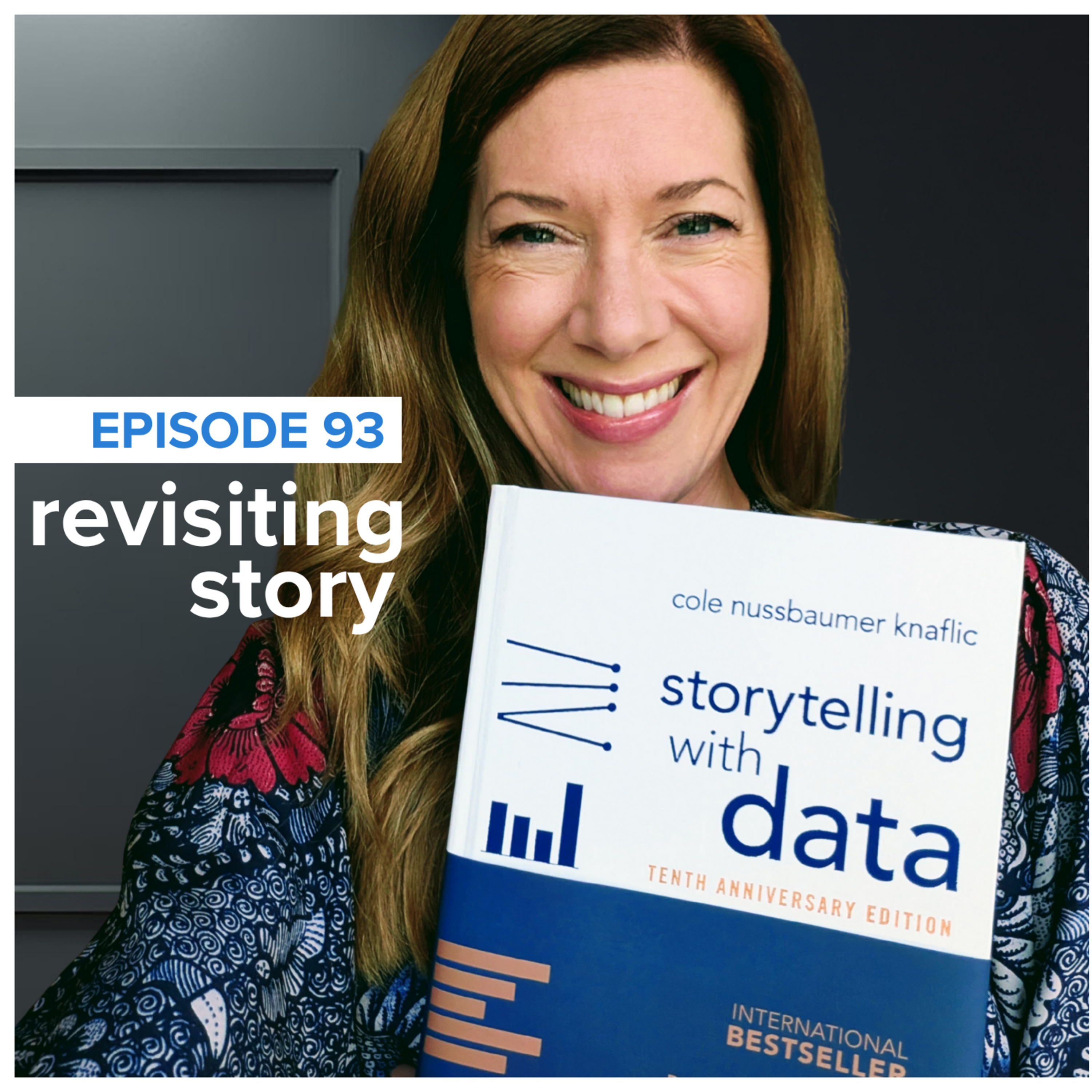 storytelling with data podcast: #93 revisiting the magic of story 16.11.2025 39mntIn this special episode of the *storytelling with data* podcast, Cole celebrates the 10-year anniversary of her best-selling book, *storytelling with data: a data visualization guide for business professionals*. She shares exciting updates about the newly released 10th Anniversary Edition—including refreshed visuals, updated examples, and new bonus content—along with an invitation to a live virtual event on December 2, 2025.To mark the occasion, Cole reads aloud Chapter 7: *Lessons in Storytelling*—a fan-favorite chapter that explores how story structure can be used to create more compelling data communications. From Red Riding Hood to Aristotle to Robert McKee, this episode blends timeless storytelling wisdom with practical techniques for structuring business presentations, building narrative flow, and engaging your audience through conflict, clarity, and repetition.Whether you're crafting a dashboard, pitching a recommendation, or designing a presentation, this episode is packed with strategies to help you move beyond showing data to telling *a story with data*.🔗 Get the 10th anniversary book: storytellingwithdata.com/SWD10🔗 Join Cole's live virtual mini-workshop (Dec 2): storytellingwithdata.com/swd10register🔗 Listen to the Before & After audiobook: rbmediaglobal.com/audiobook/9781663755681/
Podcast serupa


Populer di
Podcast ini juga muncul di daftar podcast negara-negara ini.


